::-moz-range-progress
Non-standard: This feature is non-standard and is not on a standards track. Do not use it on production sites facing the Web: it will not work for every user. There may also be large incompatibilities between implementations and the behavior may change in the future.
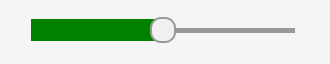
The ::-moz-range-progress CSS pseudo-element is a Mozilla extension that represents the lower portion of the track (i.e., groove) in which the indicator slides in an <input> of type="range". This portion corresponds to values lower than the value currently selected by the thumb (i.e., virtual knob).
Note: Using ::-moz-range-progress with anything but an <input type="range"> doesn't match anything and has no effect.
Syntax
::-moz-range-progress {
  /* ... */
}
Examples
HTML
<input type="range" min="0" max="100" step="5" value="50" />
CSS
input[type="range"]::-moz-range-progress {
  background-color: green;
  height: 1em;
}
Result
A progress bar using this style might look something like this:
Specifications
Not part of any standard.
Browser compatibility
| desktop | mobile | ||||||||||
|---|---|---|---|---|---|---|---|---|---|---|---|
::-moz-range-progress | |||||||||||
See also
- The pseudo-elements used by Gecko to style other parts of a range input:
::-moz-range-thumbrepresents the indicator that slides in the groove.::-moz-range-trackrepresents the groove in which the thumb slides.
- CSS-Tricks: Styling Cross-Browser Compatible Range Inputs with CSS
- QuirksMode: Styling and scripting sliders